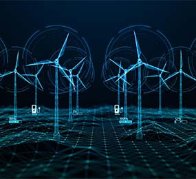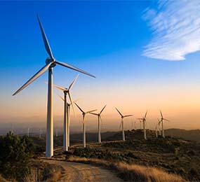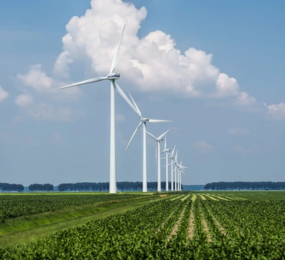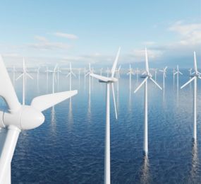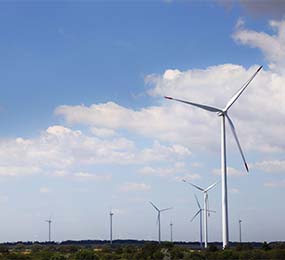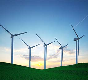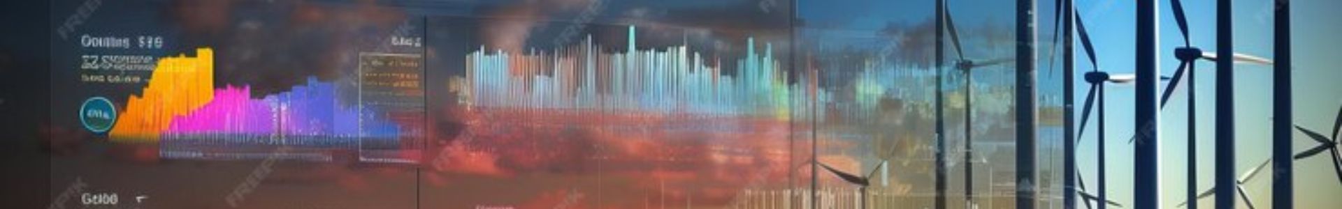
Wind farms generate vast amounts of data, ranging from turbine performance metrics to environmental factors. To make sense of this data and communicate its insights effectively, data visualization is essential. By transforming complex data into clear and understandable visuals, data visualization empowers stakeholders to make informed decisions, optimize operations, and drive sustainable growth.
Key Benefits of Data Visualization in Wind Farms:
- Enhanced Understanding: Data visualization translates complex data into visually appealing charts, graphs, and maps, making it easier for stakeholders to comprehend trends, patterns, and anomalies.
- Improved Decision-Making: Visual representations of data can help identify areas for improvement, optimize resource allocation, and make more informed decisions about maintenance, operations, and investments.
- Enhanced Communication: Data visualization facilitates effective communication between different stakeholders, including investors, policymakers, and the public. By presenting data in a clear and compelling manner, it's easier to convey the value and impact of wind energy projects.
- Increased Transparency: Data visualization can be used to increase transparency and build trust with stakeholders by providing clear and objective information about wind farm performance.
Best Practices for Data Visualization in Wind Farms:
- Choose the Right Visualizations: Select visualizations that are appropriate for the type of data being presented. For example, line charts are effective for visualizing trends over time, while bar charts are useful for comparing different categories.
- Use Clear and Consistent Labeling: Ensure that charts and graphs are clearly labeled with meaningful titles, axes, and legends.
- Limit Visual Clutter: Avoid overloading visualizations with too much information, as this can make them difficult to understand.
- Consider the Audience: Tailor visualizations to the specific needs and interests of your target audience.
- Utilize Interactive Dashboards: Interactive dashboards can provide a dynamic and engaging way to explore data and uncover hidden insights.
Examples of Data Visualization Applications in Wind Farms:
- Turbine Performance: Visualize turbine output, efficiency, and maintenance history over time to identify trends and areas for improvement.
- Grid Integration: Track wind power generation and grid demand to optimize energy dispatch and ensure grid stability.
- Environmental Impact: Visualize the environmental benefits of wind energy, such as carbon emissions reduction and habitat conservation.
- Investor Reporting: Use data visualization to create compelling reports that demonstrate the value and performance of wind energy projects.
By harnessing the power of data visualization, wind farm operators can communicate the value and impact of their projects more effectively, drive sustainable growth, and build strong relationships with stakeholders.
To register or learn more about the Forum please check here: https://bit.ly/3K0rUIz
For more information and group participation, contact us: [email protected]