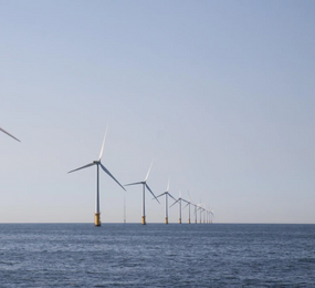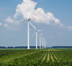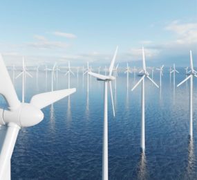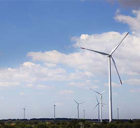
Wind farms generate a massive amount of data – from turbine performance and weather conditions to grid integration and maintenance records. To effectively leverage this data and unlock its full potential, wind energy professionals need tools that can transform raw data into meaningful insights. Data visualization plays a crucial role in this process, allowing operators to understand complex information, identify trends, and make informed decisions.
Key Benefits of Data Visualization in Wind Energy:
- Enhanced Understanding: Data visualization transforms complex datasets into easily understandable charts, graphs, and maps. This allows operators to quickly grasp key trends, identify anomalies, and gain a deeper understanding of wind farm performance.
- Improved Decision-Making: Visual representations of data facilitate better decision-making across all aspects of wind farm operations, from maintenance planning and resource allocation to grid integration and market participation.
- Enhanced Communication: Data visualizations provide a clear and concise way to communicate complex information to stakeholders, including investors, regulators, and the public.
- Improved Collaboration: Interactive dashboards and visualizations enable better collaboration among team members, facilitating knowledge sharing and improving operational efficiency.
Applications of Data Visualization in Wind Energy:
- Performance Monitoring: Visualize turbine performance data, such as power output, energy production, and maintenance history, to identify trends, anomalies, and areas for improvement.
- Grid Integration: Visualize wind power generation and grid demand to optimize energy dispatch, ensure grid stability, and identify opportunities for grid integration.
- Predictive Maintenance: Visualize sensor data and maintenance records to identify potential equipment failures and schedule maintenance proactively.
- Risk Assessment: Visualize potential risks, such as extreme weather events and grid congestion, to inform decision-making and develop mitigation strategies.
Key Tools and Technologies:
- Business Intelligence Platforms: Tools like Tableau, Power BI, and Qlik Sense offer powerful data visualization capabilities, enabling users to create interactive dashboards and reports.
- Geographic Information Systems (GIS): GIS software can be used to visualize wind resources, turbine locations, and environmental factors, providing a spatial understanding of wind farm operations.
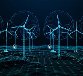
- Machine Learning and AI: Machine learning algorithms can be used to identify patterns and anomalies in data, and AI-powered tools can generate interactive visualizations that provide deeper insights.
By effectively leveraging data visualization tools, wind farm operators can unlock the full potential of their data, optimize operations, and contribute to a more sustainable and efficient energy future.
To register or learn more about the Forum please check here: https://bit.ly/3K0rUIz
For more information and group participation, contact us: [email protected]